


“Wabi” came to life through my dream vision of a chromatic skateboard and lifestyle identity. I incorporated dynamic shapes with bold color palettes to create a vibrant look for all graphic elements of the brand. The logo and skate deck designs originated as hand drawn illustrations, which were then turned digital.
"Wabi" became an identity I helped create with my peers. The logo, skate decks and t-shirt graphics were my contribution.
To explore the process of creating a brand identity package from the ground up, I created a fictitious donut and pastry shop. My inspiration came from mid 20th century soda shops, places that were typically cheery, family friendly and surrounded by color. With those images in my mind, I chose a palette of bright turquoise, tangerine, muted cream and baby pink to bring this vivacious and welcoming donut shop to life. A primary logo, alternative logo and submarks were created with the intention of using them interchangeably with the five various brand colors.
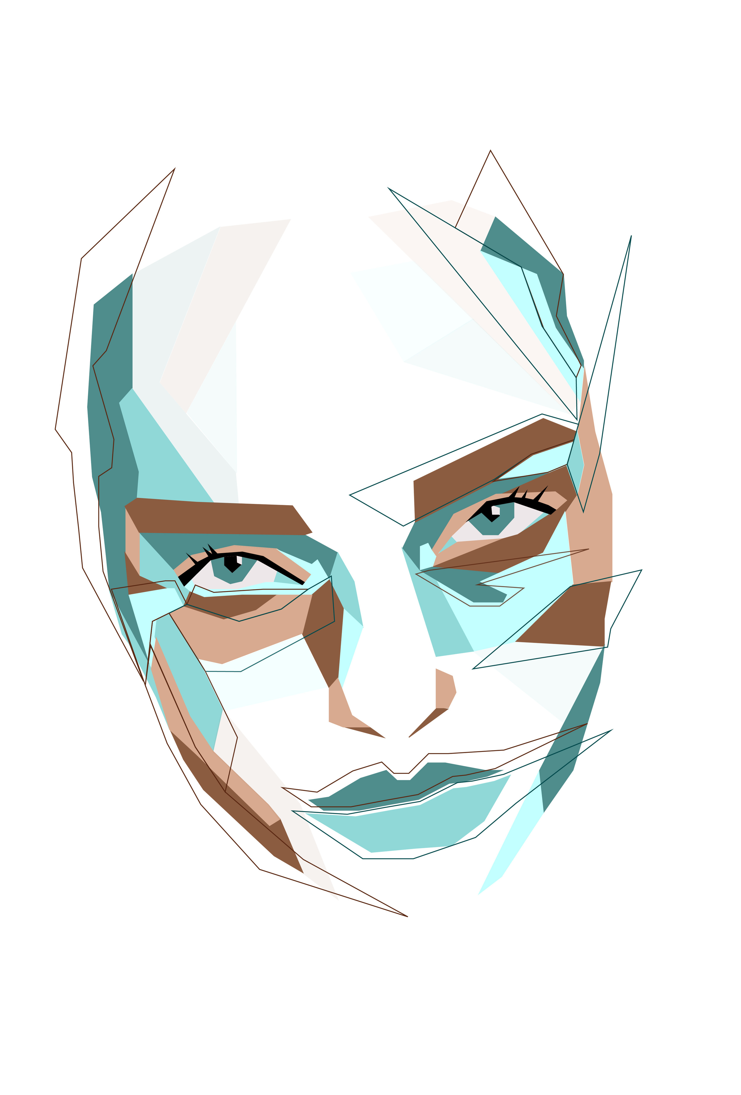
Drawing traditionally has always been hard for me, but working with shapes and colors has always felt like a sweet spot. Here’s my interpretation of drawing a portrait!