
Aruba Meridian : Maps Editor
What is Meridian?
Aruba Meridian is a cloud-based, software-as-a-service (SaaS) solution that bridges the gap between the physical and digital world with indoor mapping and asset tracking. Through integration with Aruba’s beacons and tags hardware, Meridian apps provide turn-by-turn directions in a facility, and provide location tracking for valuable assets. Typical clients include organizations and venues like corporate and university campuses, as well as stadiums, airports, museums, hospitals, and retail stores.
As a product designer for Meridian, I designed intuitive and functional experiences for their mobile apps and web-based content management system.
The Challenge:
Meridian’s indoor location content management system needed a redesign, specifically the mapping portion. The Mapping Editor is where a customer configures and maintains their routes, maps, beacons, and placemarks so that all this information displays correctly on their app. It is the most integral part of the location setup process, and also the area where the most mistakes occur. It was essential that we really nail this design, so user interviews and testing were involved consistently throughout the entire process from ideation to development.
My Role:
The Team:
I joined Aruba Meridian while the team was in the middle of this project, so I had some catching up to do! My hand in this dealt more with the interface design and user experience strategy rather than the initial research and discovery phase.
UX Strategy and Design
Front End Editor Team
Product Manager
Pain Points:
Before I was involved with this project, feedback was collected through interviews with customers to discover pain points and to define a clear strategy for addressing them. Here is what my team uncovered:
Creating a route in the Editor is not intuitive
Routing needs to include portals (stairs and elevators) which were originally in a different portion of the Editor
Placemarks are not customizable
A user is unable to see a map while they are editing entities
Goals:
Build a map editing surface that offers a seamless experience for users who are adding placemarks, routing, or portals.
Original Maps Editor:
Here is an example of the original maps editor screen in routing mode. Overall the interface is more confusing than it is helpful. In this mode, a user is restricted to setting up only the pathways. They needed to go elsewhere in the editor to add elevators and stairs. Highly inconvenient!
In this screenshot of the original maps editor, a user is setting up a placemark. A common complaint from users was that the placemarks could not be custom, and the type choices were limited to common things such as “Dining,” “Bathroom,” and “Conference.” This created a very limiting experience.
User Flow Overview:
This user flow mapped out the entire structure of the Meridian Maps Editor. Because I joined the team in the middle of this project, it was important for me to have a visual like this to refer to so I could quickly grasp how all the actions were connected. This user flow map kept the bigger picture clear for me as I was learning the product and assisting with strategy decisions for the editor.
Sketches:
Whiteboard sketches from early team brainstorming sessions; these sketches demonstrate the big ideas that were being fleshed out before I joined. Here, we can see the team was tackling the overall structure of the editor. Do we keep the original design of map on the left and sidebar on the right? Do we add tabs or lists instead?
Ideas for routing were being developed during this whiteboard session. One of the pain points that customers brought to the team was the fact that while in routing mode, things such as placemarks and labels could not be seen. These things really add context when creating a path. A visibility layer option is being sketched out here to tackle that issue. Additionally, the idea of putting portals (stairs and elevators) in the routing mode is being explored.
Initial Wireframes and Solutions:
With the goal in mind, ideas were mocked up on how to make an intuitive mapping editor experience. The decision was made to keep the map view on the left and the actions and editing all on the right. This split screen design ensures users always know where they are working within their multiple floors, and makes editing easy to navigate.
Placemarks:
Tackling placemarks was a big area of focus. Placemarks are all the points of interest on a user’s map. It’s no wonder why our customers wanted these to be more customizable!
When it came to creation, we wanted a user to simply click anywhere on the map where they would like to add a new placemark, followed by a prompt to choose from multiple different category types for customization. There are 3 different placemark types to choose from as well, which are displayed in tabs for a user to choose from. The goal was to keep this as straightforward and clean as possible.
On the left screen is the idea for what the category selection could look like. Once a category is chosen, they will be directed to the right screen, which will house more customizable fields.
Routing:
Adding portals (renamed to “Connections”) to the routing mode was a huge win for our customers. By adding two tabs under routing for both paths and connections, this eliminated the issue of needing to go to a separate part of the editor to create elevators or stairs.
A lo-fi mock demonstrating the Paths and Connections tabs under Routing mode.
By including a floor picker on the map, the idea that a user could toggle between floors to add connections seemed intuitive.
High Fidelity Designs:
Major improvements were made with Meridan’s Mapping Editor to improve the experience of creating placemarks and adding new routes to their maps. After multiple sessions with our Front End Engineer team, we had found solutions to our pain points that were within scope and kept us within our production timeline.
Designs were approved based on positive feedback to prototypes and user interviews. Our new and improved mapping editor solves now allows for:
Intuitive routing
Portals included within the routing mode
Customizable placemarks
Map and entities always in view, even while editing
Placemark Editor:
This is the general view of placemarks on the map and in a list form. A user can search by floor or filter by type. From here, they can also create a new placemark.
Simply click anywhere on the map to initiate a new placemark. Choose from the three placemark types at the top of the editor.
A scrollable list of placemark types becomes available to choose from.
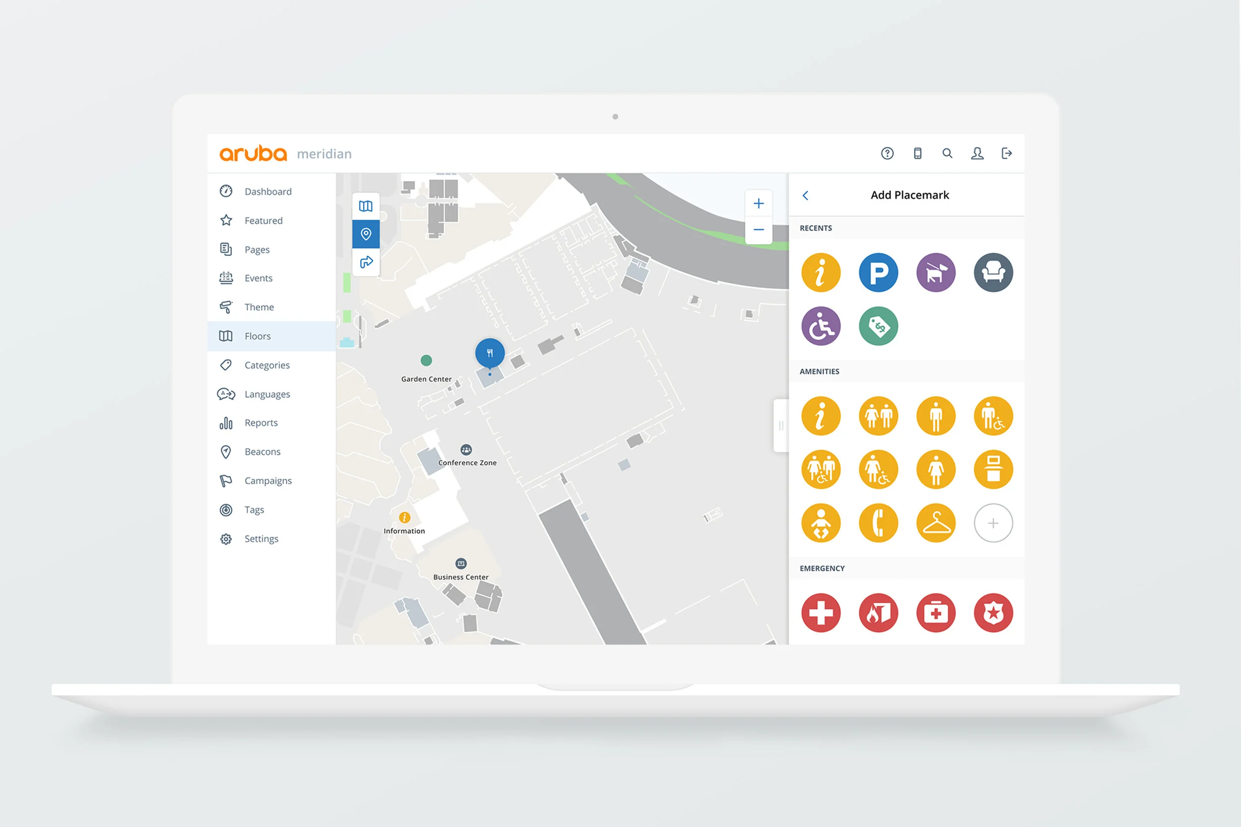
More Options!
Customers asked, and we delivered. There are now nearly 90 placemark types to choose from, under seven categories. This still leaves the option for them to add a generic placemark that is not associated with any type at all.
Create a Placemark:
Adding a placemark is a seamless experience.
Routing becomes simple!
Directions are now easy to follow and are much more readable. The original design kept the directions in a small key at the bottom right of the map, while this design keeps them front of mind.
Simplicity
Adding a connection (portal) is as simple as clicking a node. Utilizing the floor picker on the map allows for a seamless way to connect elevators and stairs.
All layers stay visible:
One thing our customers find helpful when setting up their placemarks and routes, is the ability to see what they have set up previously! We added a visibility layer function to our maps so different entities could be toggled on and off. This gave our customers a better sense of where to place their paths and points of interest.
Continuous Research:
The new Meridian Maps Editor has recently launched! However, design is never done, so we included a link to a customer feedback survey. This link will hang out there for awhile as customers continue to play around with our new designs, but they can always collapse it so it doesn’t get in the way of their work! The future of the Maps Editor is looking bright, as improvements will continue based off the feedback that is received.
Takeaways:
Entering a massive project like this one while in the midst of ideation and development was challenging as a designer, but there were also a few advantages. Because I was looking at this Editor with fresh eyes, I was able to instantly spot what was intuitive and what wasn’t. I essentially was a brand new user! It’s really important to get fresh eyes on designs when it comes to long term projects such as this.
Move through your own prototypes with your team often! There were a few workflows that took us a while to get down. Instead of talking through them and getting confused, we should have utilized the prototype to explain our ideas and understand our pain points
At the end of the day, customers just want things to be simplified and look clean!