
Aruba Meridian Sensors App

What is Meridian?
Aruba Meridian is a cloud-based, software-as-a-service (SaaS) solution that bridges the gap between the physical and digital world with indoor mapping and asset tracking. Through integration with Aruba’s beacons and tags hardware, Meridian apps provide turn-by-turn directions in a facility, and provide location tracking for valuable assets. Typical clients include organizations and venues like corporate and university campuses, as well as stadiums, airports, museums, hospitals, and retail stores.
As a product designer for Meridian, I designed intuitive and functional experiences for their mobile apps and web-based content management system.
The Challenge:
Meridian needed an all-in-one app that allowed for users to maintain, deploy, and troubleshoot their Aruba beacons and tags hardware. This app needed to accommodate a variety of specific use cases, and provide a painless experience when switching context between the beacons and tags hardware.
Meridian originally had separate apps for the deployment and maintenance of their tags and beacons, so we needed to seamlessly combine these two apps into one, while making the app better and more efficient than what already existed.
For reference:
Beacons are bluetooth devices that Meridian-powered apps use to determine a device’s location and provide turn-by-turn directions. Beacons can also be used to send location-specific messages to devices within range.
Tags are devices used to track assets on a map, as part of a real-time location system.
Here are screenshots from both the original Aruba Beacons and Tags apps:
Screenshot of the original Aruba Beacons app. A user would land on this map of their beacons once they logged in.
In the original Aruba Beacons app, this is what a user would see when they click on a beacon to get more info.

In the original Aruba Tags app, the map and list of the tags hardware were kept separate from each other. This is what they would see upon logging in.

Screenshot of the original Aruba Tags app. A user would need to navigate to this tab to see their assets on a map.
My Role:
The Team:
The design team was small at Meridian, consisting of myself and the product design team lead. We were responsible for the design architecture, UX strategy, and all activities end-to-end from research to delivery.
UX Strategy and Design
Mobile Engagement Engineer Team
Product Manager
Research:
We involved our Mobile Engagement Engineers heavily in our research, as they are the ones who go out and use these apps to deploy the hardware for customers. Additionally, they are tasked with using these apps for troubleshooting and hardware maintenance. This makes them very aware of the challenges that our customers experience, because they are also one of our main users. After multiple interviews with them, and discussions reviewing data collected over time from our customers, we were able to identify our goals for the new all-in-one app (to be called Sensors,) and identify pain points we wanted to address.
Main Goal:
Design an app that allows users to deploy, maintain, and troubleshoot both their Aruba beacons and tags hardware.
Pain Points to Address:
Overall, troubleshooting needs to be clear and intuitive for the customer, currently it is not ideal and customers do not know how to diagnose their problem
Specifically, there needs to be a way to identify which beacons are manipulating the blue dot.
Searching for a specific beacon or tag should be simple
Deploying hardware needs to be efficient and fast for high volume set ups
User Map:
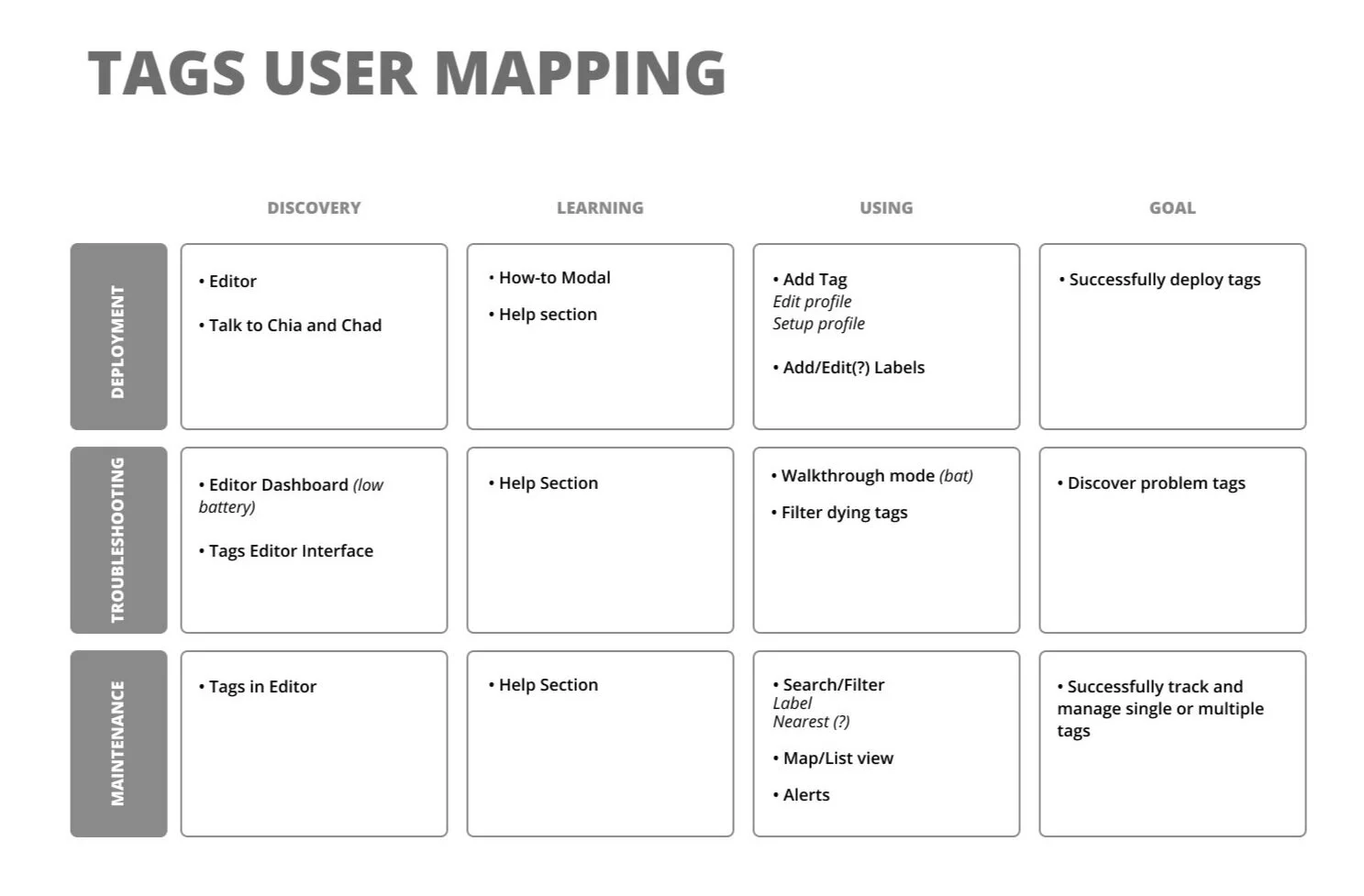
We took the 3 pillars of our goal (deployment, maintenance, and troubleshooting,) and broke down a user’s journey for both beacons and tags. This was a more high level approach so we could tackle the cycle of discovery, learning, and using.

Original whiteboard session for the beacons user map.

Original whiteboard session for the tags user map.
User Flow:
Using what we collected from our research, we mapped out the flow of the Sensors app. We set up the architecture keeping in mind that there was a lot to cover!


Wireframes:
With our lo fi screens, we set out to test initial ideas that would answer some of our bigger design challenges:
How are we going to handle the transition between the beacons and tags?
How do we plan on showcasing a map view and a list-view of the hardware?
How will a user see the beacon or tag details? Can they edit details?
How will deployment work?

We wanted our users to be able to effortlessly switch between the map view and list view of their hardware, rather than having to go to separate pages in the app to do so. A bottom sheet was our solution, as it keeps the list view visible and the actions readily available.
Additionally, a bottom tab seemed to be a good solution for navigating between Tags and Beacons. At the time, we needed to add an additional third tab “Campaigns,” so the bottom tab placed the top-level and frequently-used actions at the bottom of the screen, where a user can access them easily.
We wanted a user to be able to see the details of their hardware and see it on a map simultaneously. When a user clicks on the beacon or tag on the map, the details would then appear in the bottom sheet. From there, the user can view, edit, and interact with the hardware. We liked how clean and simple this solution was.
When it came to deploying a tag or beacon, we wanted to keep the process the same for both. From the list view, they can choose an unconfigured hardware from the list or simply click “Add” to initiate the process. If a specific beacon or tag is not chosen from the list, the app will search for the hardware closest in proximity. Once found, a user can place the hardware on a map and configure the correct details.
High Fidelity and Visual Design:
Constant communication with our development team helped to flush out what was possible and feasible to produce in our time frame. Along with team discussions and references from previous customer interviews, some adjustments were made to our designs to avoid redundancy and to support the evolution of Aruba hardware management.
After several walkthroughs of our wireframes with our Product Manager and the Customer Success team, we were ready to dive deeper into the look and feel of the Sensors app.
We were now confident that the new Sensors app:
Provided a painless and efficient experience for deployment of both beacons and tags
Made troubleshooting easy to understand and use
Kept tags and beacon details organized and easy to find
Was approachable and intuitive
Making some UX changes:
During the high fidelity design phase, a few things changed about the structure of our app. Originally, we opted for bottom tab navigation to allow our users to get to Beacons, Tags, and Campaigns. However, we were later informed that Campaigns were going to be deprecated and we no longer needed to include them in the new Sensors app. This news caused a bit of a structural change to the navigation of our app, because it no longer made sense to have only two tabs at the bottom of the screen.
After deliberation, we concluded that Beacons and Tags are both using the same map, so why not include a toggle between the two in the map itself? This provided a clean solution to our issue, and still keeps the two options highly visible.
Lists and Details:
Searching for a specific tag or beacon is now straightforward with a filtering system. Users can filter by different beacon types, and filter tags by assigned labels. We made organization between deployed and undeployed hardware an option as well with a tab system.
When a beacon or tag is tapped on the list, all details about the hardware are revealed, including the option to edit details such as the name.
Easy Navigation:
A list of the hardware is available to a user with a simple swipe of the bottom drawer. The list is ordered by proximity, and the app will specify if it’s deployed on a floor other than the one that is currently set on the map.
Editing beacon or tag details is accessible from this bottom drawer, eliminating the need to go to the web based Meridian Editor to make changes.
The bottom drawer is also where a user will access deployment. An undeployed beacon or tag will always have a plus sign next to it, giving the user the option to quickly configure a specific device from the list.

Deployment:


Troubleshooting becomes friendly!


Troubleshooting now comes with approachable and helpful directions that greets a user the first time they arrive in this mode. These directions will always be available to users if needed!

One of the pain points that was brought up consistently in our research, was the fact that our customers could not decipher which beacons were influencing their blue dot. In order to solve this issue, we came up with a simple troubleshooting mode called Associated Beacons. In this mode, the beacon emitting the strongest signal changes color from grey to orange. Other beacons whose signals are affecting the blue dot, but are not as strong, will turn a lighter orange.
The Work Continues:
With the new Sensors app structure and look in place, development has recently begun. Aruba Meridian Sensors app is planned for release this spring, followed by the deprecation of the original Beacons and Tags apps at the end of 2020.
Takeaways
During the wire framing phase, it is important to include developers & hardware engineers as early as possible to validate the feasibility of design and to make sure we are covering all our bases. There were a few times we had to go back and add more details in because we didn’t have all the information surrounding the hardware
It’s very important to keep in mind all of our user types while designing. Because we had the Mobile Engagement Engineer team with us throughout our design process, at times the features we were building felt biased towards only their needs
Staying organized is so important! After coordinating many interviews, digging up insights, and turning those findings into features, there were moments that our research felt scattered across multiple notebooks and documents. We found ourselves asking a few questions over and over which became frustrating. I’ve learned that keeping detailed notes is crucial to understanding the “why” months later