
Yoga Journal
Yoga Journal’s bright yellow branding aided in making content pop throughout their site, balanced out by font choices that complemented their classic looking logo. Readers come to this site for the encyclopedia of yoga poses and informational videos, and my goal was to make this site as organized as possible.
My role:
As a Creative Designer at Say Media, I took on the responsibility of presenting web design strategies to key publishers, and aligned client requests with product capability to create beautiful media rich experiences. I was the sole designer on these projects, and I was responsible for layout creation, fonts and colors, as well as user experience strategy.
Main Goal:
The big challenge with this site design proved to be building out a deep taxonomy of yoga poses and educational videos that was intuitive to navigate. Many custom page templates were designed to provide readers with a seamless experience when exploring the Yoga Journal site.
Style sheet for Yoga Journal
Site Styling:
Yoga Journal’s branding really mixed modern with classic by using an eye-catching yellow as their primary color, juxtaposed with a traditional serif logo. I needed to come up with a color palette that would compliment their brand yellow, while not overwhelming the readers with too much pop. I settled with a blue of equal brightness to balance out the yellow, while keeping all the text in grey scale.
I also wanted to pay a tribute to their logo by using a neat and friendly looking serif font for the headlines. I modernized the rest of the site by using approachable san-serif fonts for the body and link copy.
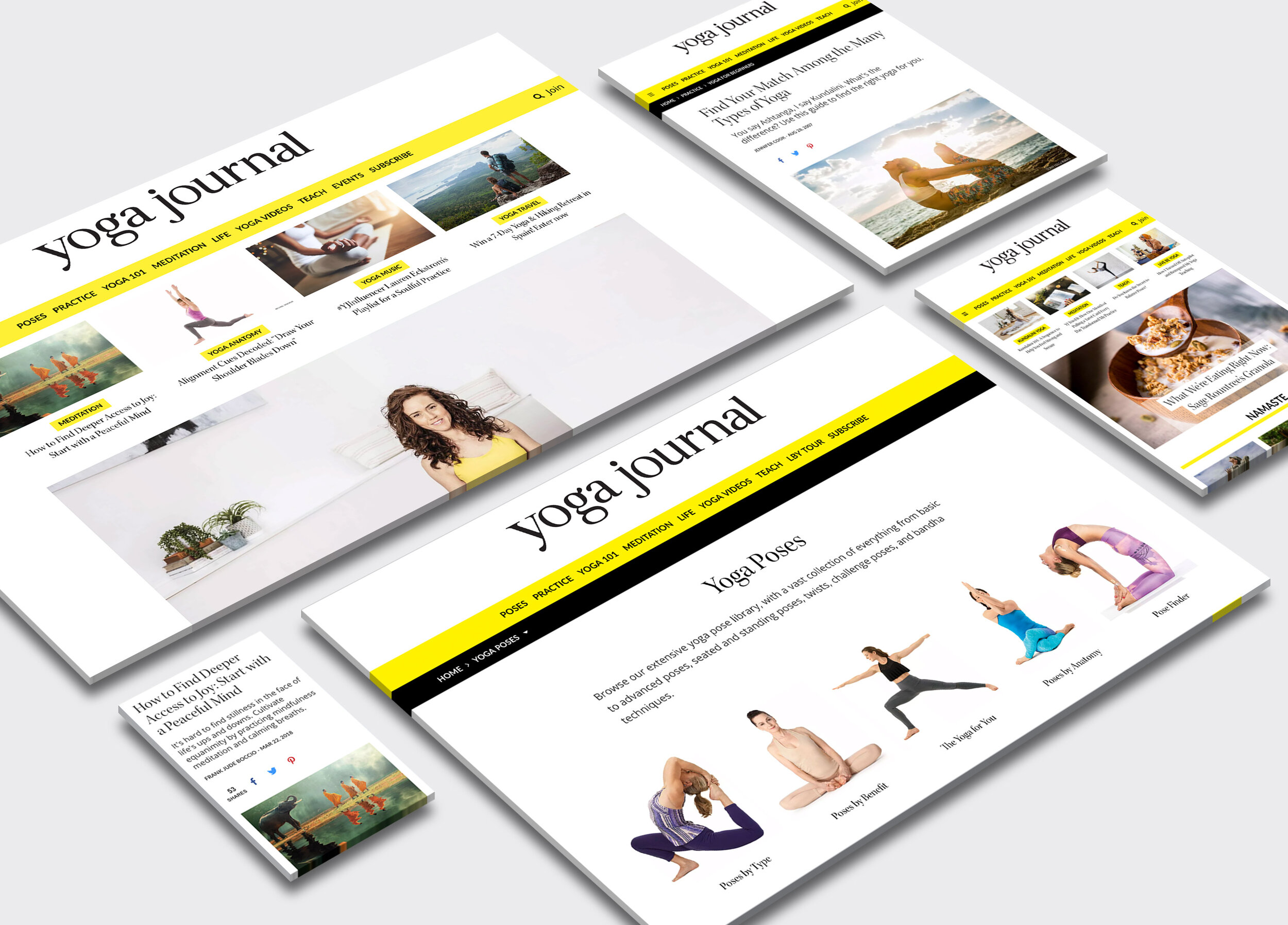
Poses Page:
With hundreds of how-to pages, we needed to organize all the various poses in a way that a reader could quickly discover what they were looking for. Knowing that most people don’t know yoga poses by name, I set out to organize them by categories. Poses by Type, Benefit, Anatomy and more helped people narrow down their hunt without having to spend too much time doing research.
Breaking up the poses this way also created a fun way for visitors to explore all the various teachings Yoga Journal has to offer on their site.
The landing page for the encyclopedia of yoga poses
Subpage of the poses encyclopedia
Clicking into one of the over-arching pose categories would take a reader into a subpage of classified articles aimed to get a reader to the pose they’re looking for. Here is an example of the Poses by Benefit page, you can see here that the articles are arranged by ailment in a clean and sophisticated grid.

Homepage:
White space is always important when I’m designing websites, as it provides balance and better organizes content. I made sure that the homepage carried this strategy over and had the same organized look as the pose pages with smaller heroes in neat grids.
Beautiful Responsive Design:
With 1 million page views a month, the design of this site was crucial for maintaining readership. Knowing this, I made sure Yoga Journal was designed with mobile and tablet in mind. It was important that the structure of the poses pages held up on these devices for yogis on the go. The clean fonts and pops of color provide for a beautiful reading experience no matter what device you’re on.
